The Pure Company was backed by a company with a nearly 100-year history in the healthy home industry. They provide both the knowledge and experience needed to help you make smart, personalized choices when it comes to products that improve your home, family, and life.
- Project: Brand Development, E-Commerce Website UX & Visual design
- Year: 2018 – 2021
THE IDEA FOR THE BRAND
In our search for products we can buy to create healthier home environments, we found the market to be filled with unattractive,
expensive options presented with technical, confusing content.
Most companies seem out of touch with what women want and
how to speak to them.
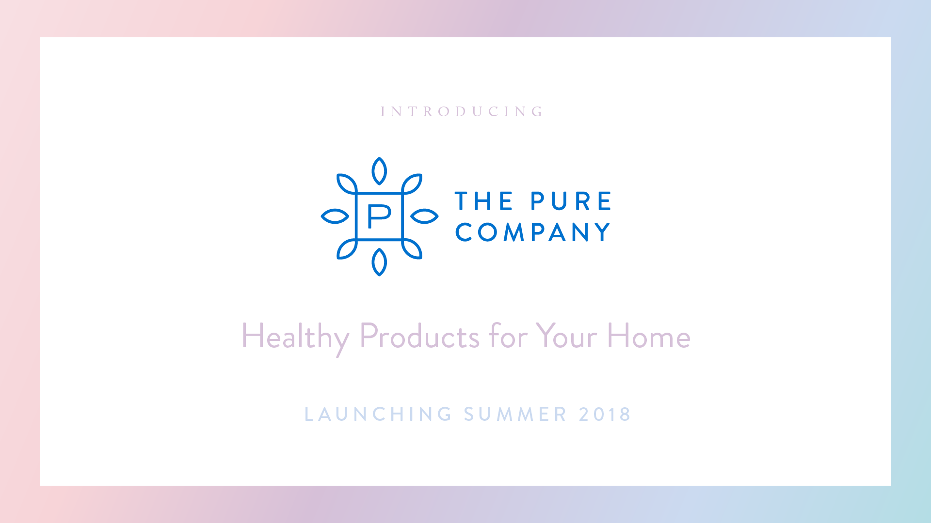
The Pure Company, to bring a better collection of products to the market for women and caring dads. Our products offer an extended range of options for a healthy home that are more affordable, beautiful to live with, simple to use and function at the highest level of performance.
We make sure that everything — from our design to the materials
we use — is produced with care and thoughtfulness.

COLOR PALETTE
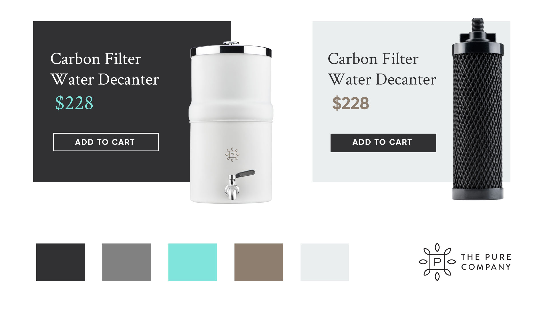
Our palette is composed of a balance of warm and cool colors. It is vibrant and bright, energetic and living, with the ability to sit back quietly when needed and speak boldly when appropriate.
The palette is designed to complement our products and promote a “pure” lifestyle, illustrating the concepts of health, beauty, and simplicity that are central to the essence of our brand.
TYPOGRAPHY
The typographic toolkit was designed to feel friendly and sophisticated, complementing our products and brand vision. Type design should always strive for simplicity, remaining clean and clear, not cluttered.
The combinations of typographic and hierarchical treatments touch on the range and versatility of the selected font families, showcasing how different types of treatments can alter the perception of a written message and help create a specific visual experience.

PHOTOGRAPHY
The photographic palette is expressive, relatable and fun. There are few limits when it comes to exploring techniques in photography and the ways they can be used to build out the brand. The following samples provide a range of examples, including authentic and warm stock photography, colorful and clean product photography, and natural conceptual photography, specifically chosen to represent The Pure Company brand and the essence of what it aspires to be.
CUSTOMER PERSONA
A typical purchase from The Pure Company will begin with a woman or a caring dad who knows what they want: simple solutions to ensure a clean, pure environment in their home. They want affordable yet beautiful products that complement their decor and infuse their home with personalized, fresh scents without introducing any chemicals into the air.
The customer is smart, perceptive, and compassionate. Details are important. They’re savvy shoppers who enjoy being well informed but are too busy to do exhaustive research. As an educated professional, our customer wants to feel confident that they’re making a smart purchase for their family. They won’t hesitate to share new discoveries and great experiences with friends.


VISUAL DESIGN
The Pure Company serves people in real homes that are not picture-perfect. Everything from the brand imagery to the most detailed copy should feel relatable and reflect our strive for authenticity and honesty as a company.
HOMEPAGE DESIGN
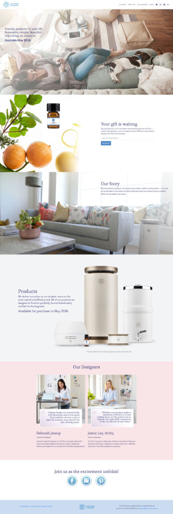
The homepage was designed with the goal of creating customer loyalty by creating a joyous experience that people want to share. With the user-friendly layout and personal touches, they go a long way toward people feeling connected to the brand as a whole and not just a singular product. The vision is to make every customer feel like they were singled out and personally taken care of.

MULTIPLE LAYOUTS


BRAND STYLE “SENSE”
The Pure Company uses a beautiful aesthetic and top-tier technology to enhance their customers’ senses so they may enjoy a healthier lifestyle. We offer the best solution for our tech-savvy health enthusiasts. “Sense” offers a clean, minimalistic color pallete that avoids too many distracting elements. The main focus is the product and message, using a simple marketing look used by many Fortune 500 companies, and is timeless, allowing us to stay current for years to come.
CONCLUSION
It was always my dream to work for a startup company like The Pure Company. From the start, I was part of the team that created the final version of the branding and web design concept. This project gave me the opportunity to explore many design styles, color palettes, and layouts, and expand my knowledge of E-commerce.
Hope you enjoyed the work and if you have any questions about my creative process you can contact me and send me a message here.


