
Allergy Buyer’s Club is the online destination for healthy-home products. Since 1998 they have offered expert reviews, a curated expert selection of well-known brands, and top-performing healthy home products with great value. Their online store has a variety of products including air purifiers, dehumidifiers, HEPA vacuums, allergy-free bedding, cooling bedding, water test and purification products, mattresses, and much more.
- Project: Brand Development, E-Commerce Website UX & Visual design
- Year: 2018 – 2021
BRAND DEVELOPMENT
The inspiration for this look and feel comes from the experience Allergy Buyers Club want people to have when engaging with their brand. The theme of this brand treatment was nick-named “Serenity” and with this look, we wanted to bring customers to a sanctuary that will lower their pulse rate and help them breathe even better before their products arrive in the mail.
COLOR PALETTE
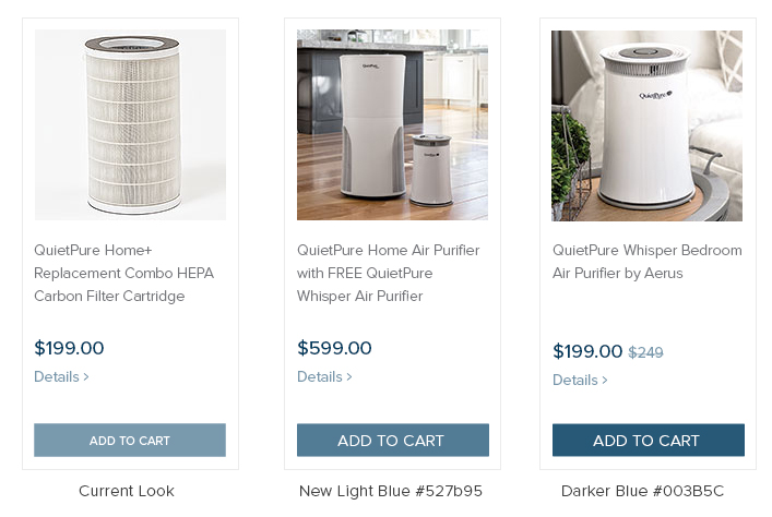
Soft Blue tones represent tranquility, trust, loyalty, healing, and sophistication. Silver and grays are meant to represent reliability, security, and modern sensibilities.
TYPOGRAPHY
Libre Baskerville and Proxima Nova were selected for their readability and ease of use, letting our customers know we’re putting their comfort first.

IMAGERY
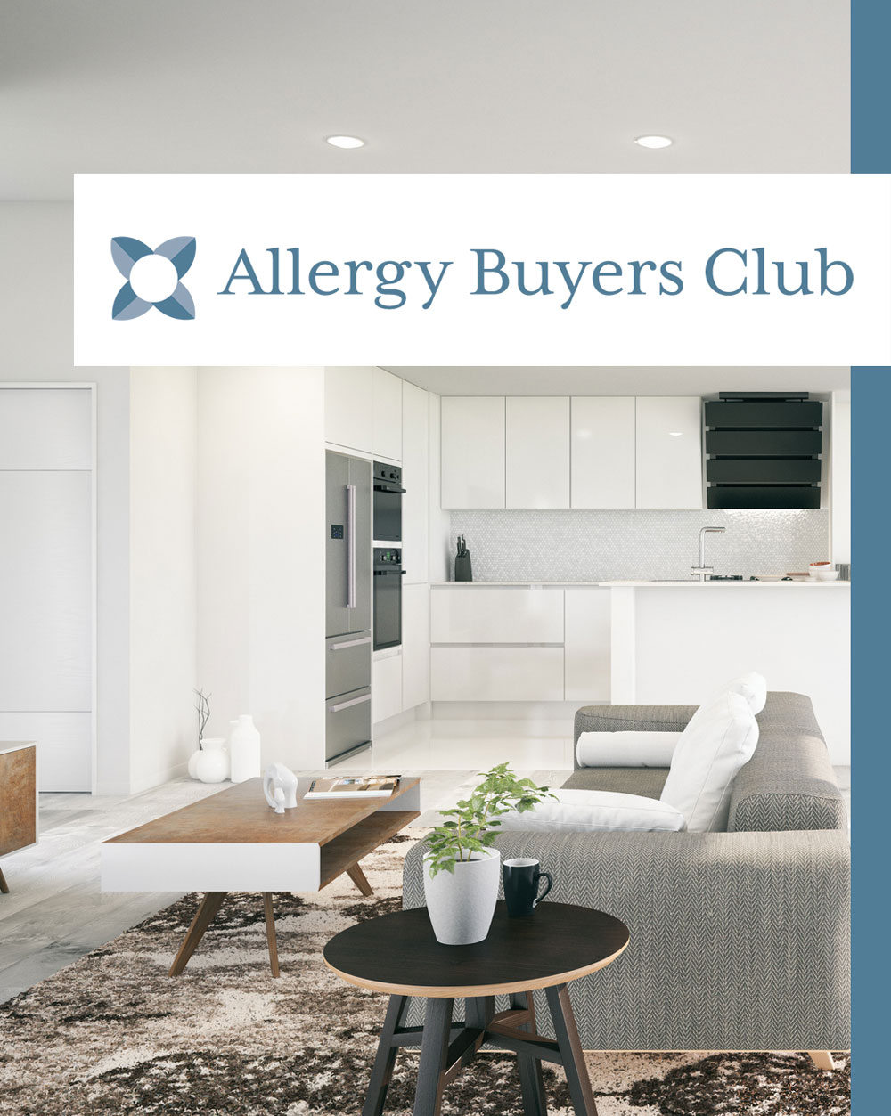
Allergy Buyers Club doesn’t just want to sell products, they want to inspire their customers. The images show the different environments and “persona” of their most likely consumer. But also give the viewer an idea of what the product could look like in a homely setting. Much like you would find in a magazine for interior design and their printed catalog for subscribers.

VISUAL DESIGN
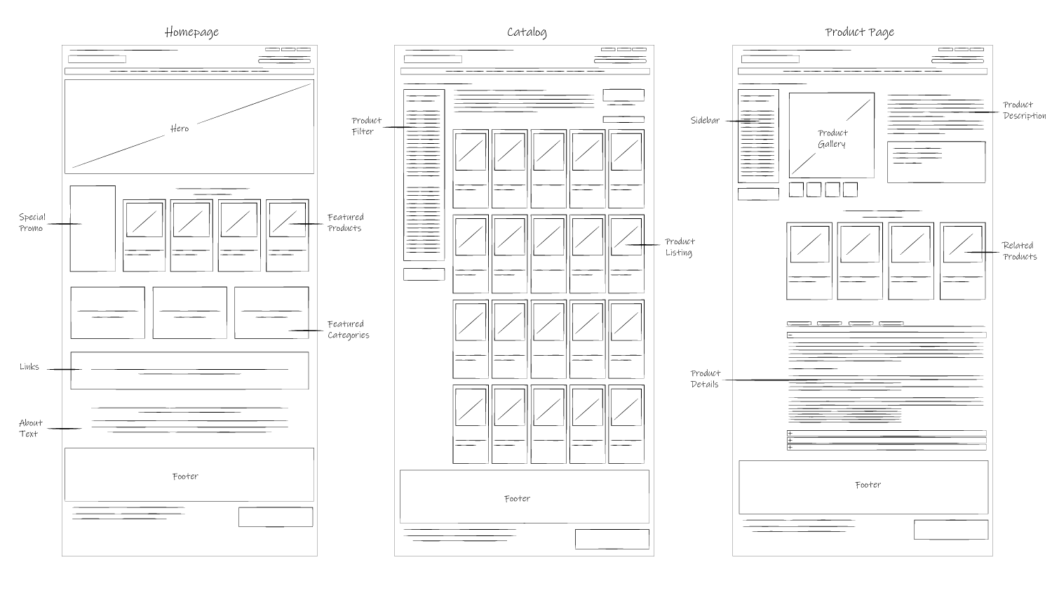
By using best practices for responsive website design, Allergy Buyers Club can feature some of its most successful and popular products across all platforms and devices. The primary purpose of the new brand development and website design was to improve the user experience while shopping in the online store. The user interface was meticulously designed from scratch with the goal of incrementing conversion and reducing clicks to buy.
THE PRODUCT PAGE DESIGN
PROBLEM:
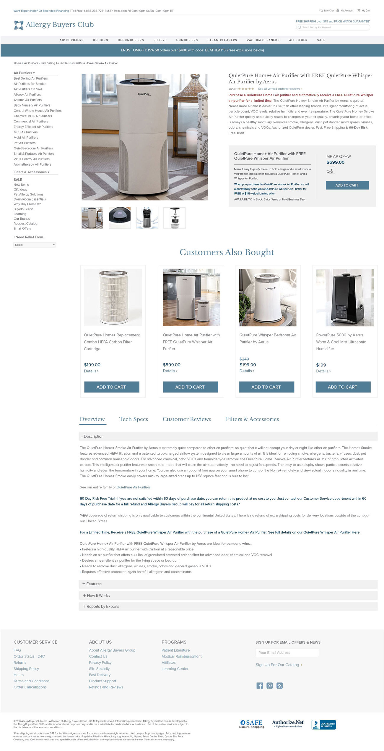
Allergy Buyers Club keeps its reputation by giving the best professional advice and information about the products they recommend. So it was important for the design to accommodate the extensive amount of content while keeping the scrolling reasonable.
SOLUTION:
I tried many different layouts but the best and most efficient was to use a tab system that had dropdowns for areas with lots of text and divide the categories on each menu tab.
CUSTOMER WORKFLOWS
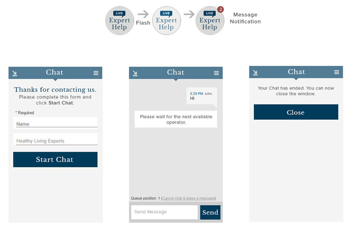
Allergy Buyers Club customers enjoy a complete shopping experience on the new website. With customer workflows created to improve user experience and increase conversion rate.
Customer Representative Chat Functionality
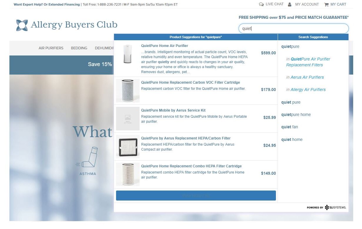
Product Search Functionality
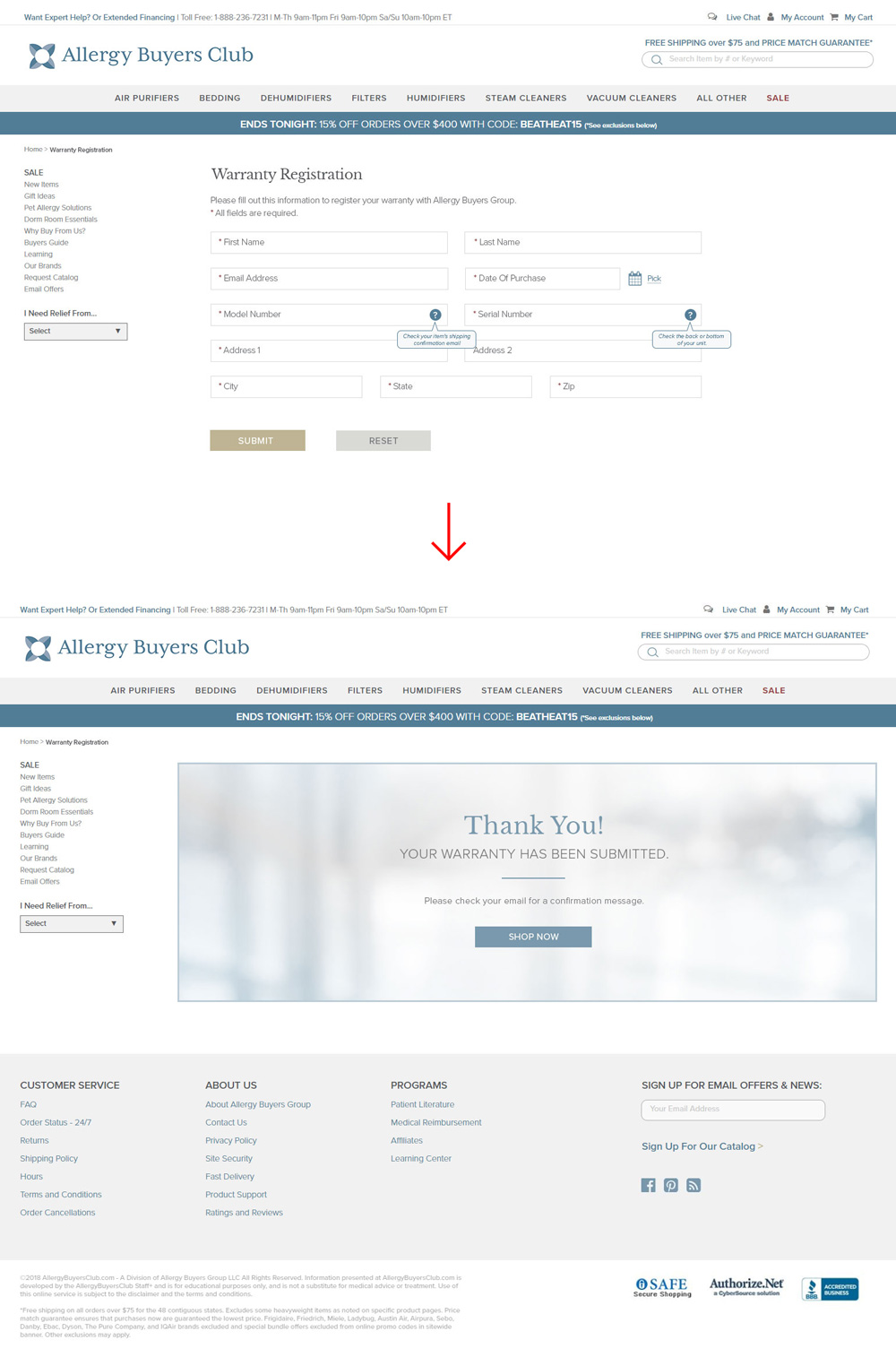
Warranty Registration Workflow
Product Page and Box Design Concepts

CONCLUSION
I have enjoyed working with Allergy Buyers Club, it is probably the best experience I ever had with a brand development project. It is a continuous learning process and every small thing we add or change makes a difference. This project taught me a valuable lesson on seeing the big picture. The website has hundreds of product pages and other pages filled with extensive content, so I had to create my concepts by thinking about how each element on the page would apply to all the different templates.
The website alone was no easy task but the brand development was equally as challenging. To bring harmony to all the chaos that was there before took patience and exploration. It felt like a puzzle placing each piece one by one until complete.
Hope you enjoyed the work and if you have any questions about my creative process you can contact and send me a message here.
